Welcome
Thank you for visiting my portfolio.
Code
Design
<head>
<meta charset="UTF-8">
<meta name="viewport" content="width=device-width, initial-scale=1.0, maximum-scale=1, user-scalable=no">
<meta http-equiv="X-UA-Compatible" content="IE=edge,chrome=1">
<meta name="description" content="UI/UX Developer Philadelphia; UI/UX Web Designer Plymouth Meeting, PA" >
<title>Jeffrey Ayling | Portfolio & Resume</title>
<link rel="stylesheet" href="css/style.css">
<link href="https://fonts.googleapis.com/css2?family=Playfair+Display:wght@400;500&display=swap" rel="stylesheet">
<link href="https://fonts.googleapis.com/css2?family=Open+Sans:wght@300;400;600;700;800&display=swap" rel="stylesheet">
<script type="text/javascript" src="js/modernizr.js"></script>
<style type="text/css">
</style>
</head>
<body>
-
001
Interactive Design | Synopsys Inc Projects
- •
- •
- •
- •
- •
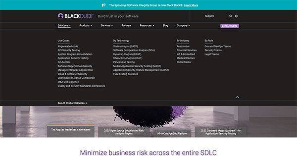
Synopsys | AppSec Navigation
As part of a division rebranding under "Black Duck," I created a new navigation and footer system to improve usability and support a global user base. Challenge: Aside from an outdated and fragmented design, the existing navigation was non-responsive and lacked good language support. Solution: I set up a more mobile-friendly navigation featuring desktop hover-based tooltips for definitions and improved a translation tool for global users. The system was fully responsive and optimized for clear, intuitive access to key content. Impact: The redesign drove a 40% increase in “Contact Sales” clicks on mobile, reduced user confusion, and improved engagement among international audiences through easy language switching.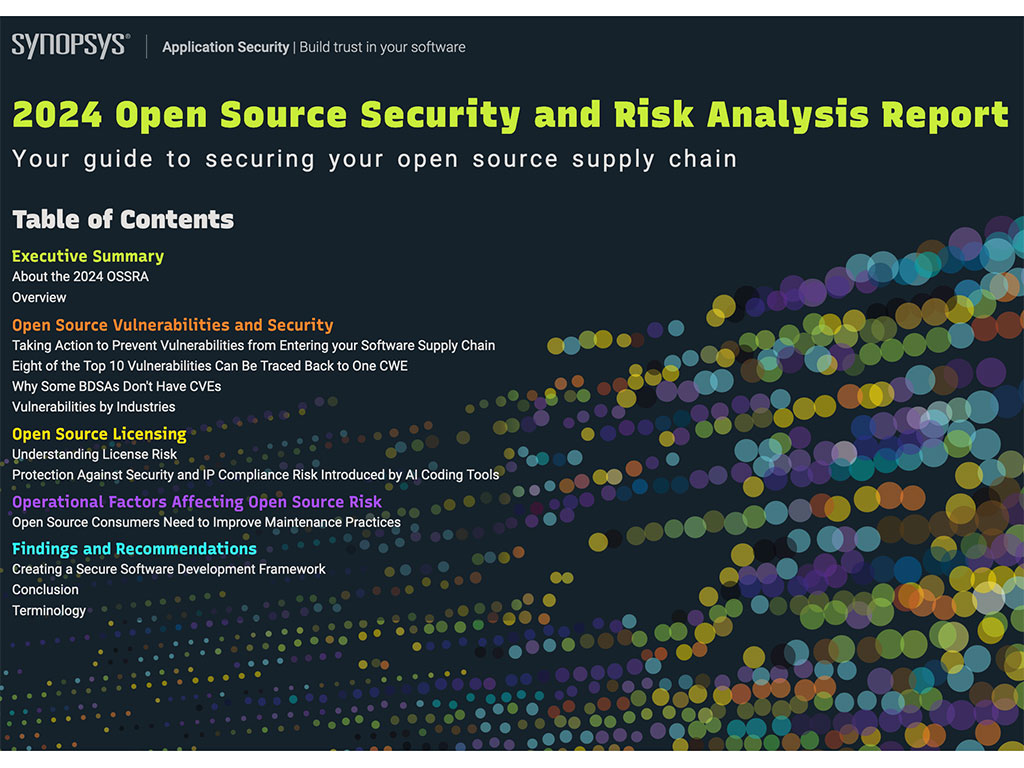
OSSRA
Led the transformation of OSSRA, the highest-traffic, Tier 1 page of the year, from a static PDF to an interactive web experience, collaborating with stakeholders to bring content to life through animations and intuitive design. Challenge: OSSRA needed to become a dynamic, on-brand experience while handling complex data presentation. Solution: Using a wireframe, I proposed then built GSAP-powered animations and user-friendly layouts that aligned with the brand’s style guide. I also worked cross-functionally to balance creative vision with technical feasibility. Impact: The new OSSRA page boosted engagement on a high-visibility asset, improved content accessibility, and delivered a polished, interactive experience that strengthened brand presence and met stakeholder expectations.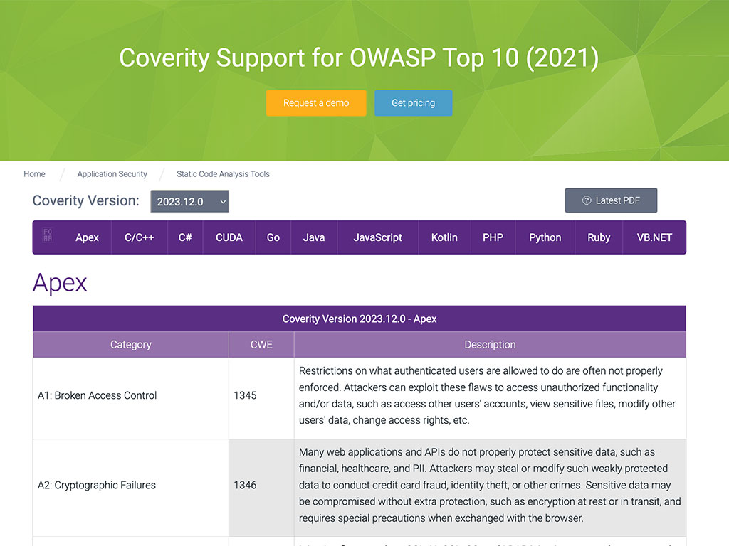
See Tables Live: Table 1 | Table 2 | Table 3 | Table 4
Responsive Tables
Transformed static, complex PDF-only data tables into fully responsive web versions, improving accessibility and usability across Synopsys' digital ecosystem. Challenge: Tables were only available as PDFs, making them hard to access for users, time-consuming to update for the content team, and frustraing to navigate on mobile devices — a major pain point for users and internal teams. Solution: I developed responsive, accessible web tables that fit seamlessly into site layouts and aligned with brand standards. These tables were also built to be easily reusable and updatable each quarter, streamlining content workflows. Impact: The new tables enhanced user experience and mobile accessibility, while also reducing content management time and eliminating manual PDF updates — now reused and updated quarterly with minimal effort.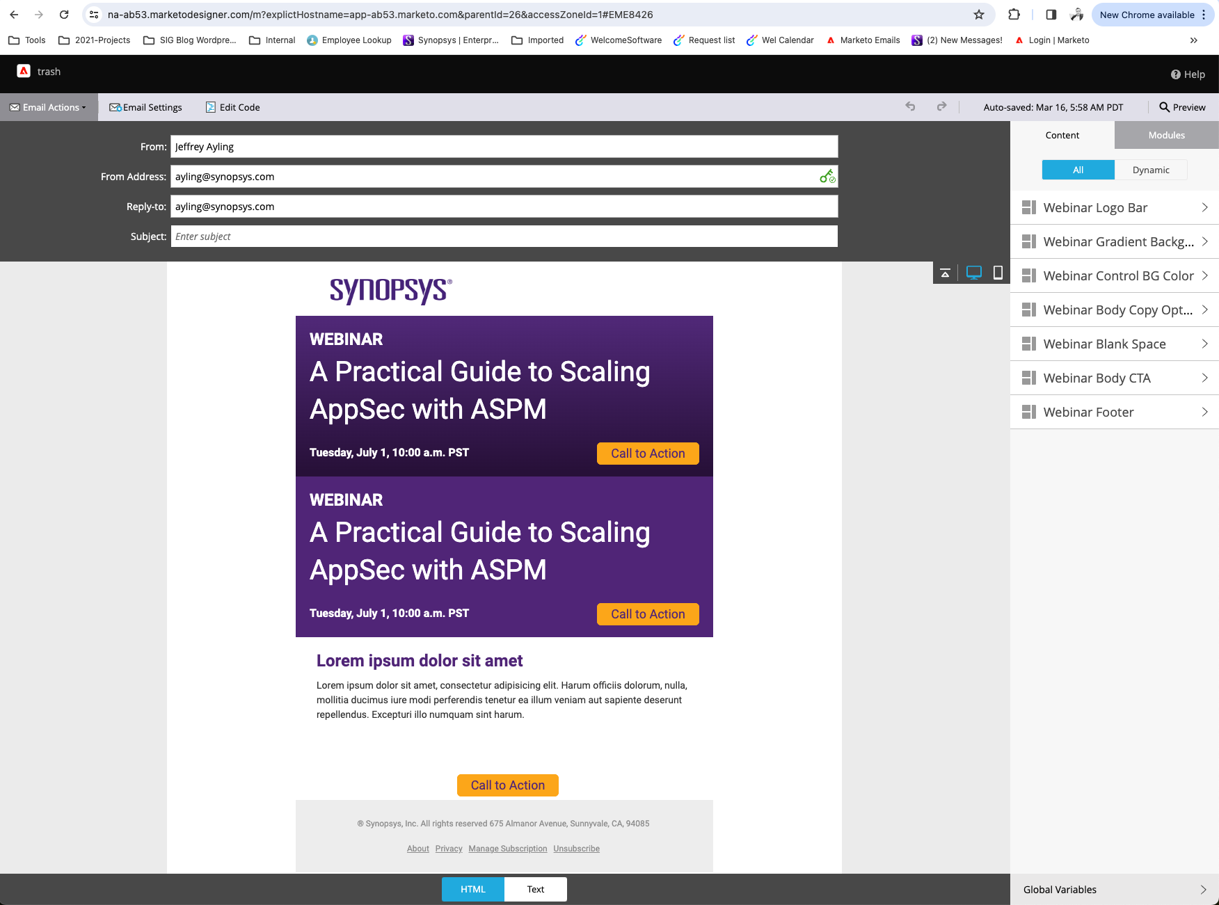
Marketo HTML Emails
Stepped outside my core responsibilities to take ownership of Marketo email template development, quickly learning the platform’s inner workings and creating custom components that streamlined authoring and improved efficiency. Challenge: Email design was outdated, with hard-to-customize templates and no standardized system, leading to inefficiencies across teams. Solution: I self-taught Marketo’s structure, mastered table-based HTML for email compatibility, and introduced componentized templates, making email creation faster, modular, and more user-friendly. Impact: The new system accelerated email creation, reduced errors, and ensured consistent branding — and saved the company over $26k by eliminating the need to outsource to an agency.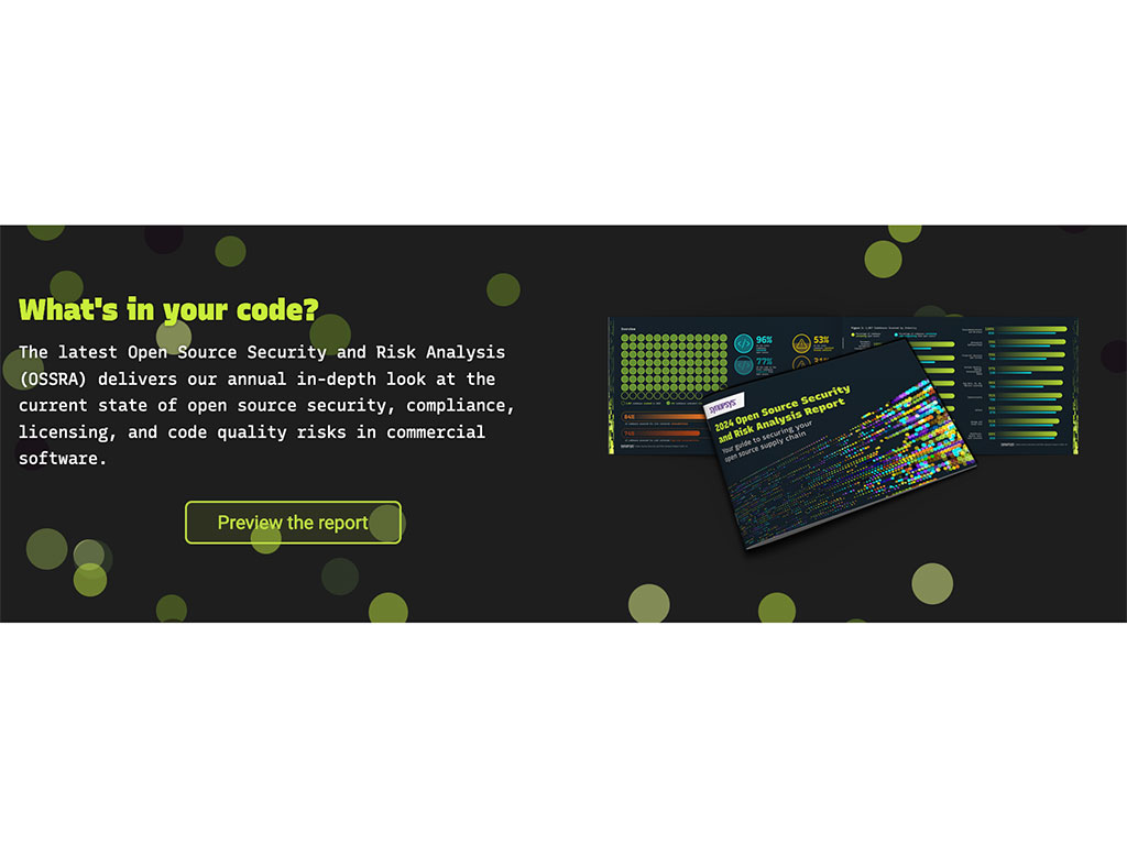
Experience Fragments
Designed and developed reusable components like this dynamic banner using AEM Experience Fragments, enabling single-point updates across multiple pages for efficiency and consistency. Challenge: Content updates were manual, time-consuming, and prone to inconsistencies across the site, making large-scale updates difficult to manage. Solution: Built modular Experience Fragments that allowed global content updates from a single source. Focused on scalable, maintainable designs aligned with brand guidelines. Impact: Improved site-wide consistency, cut update time significantly, and enabled faster rollouts of campaigns and messages — enhancing both team workflow and user experience. -
002
UI Design | J.W. Pepper Projects
- •
- •
- •
- •
- •
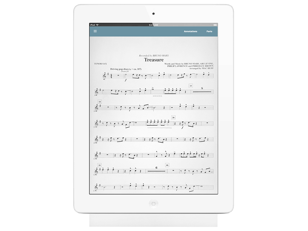
ePrintGo App
This is an app for downloading digital sheet music. I assisted as an interative designer & supplied icons.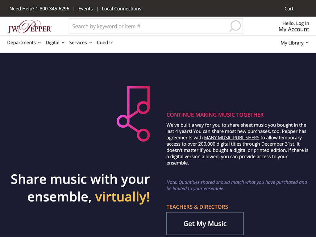
Share Music
In response to the pandemic, my boss & I quickly built out a remote tool for our customers in a week. He did the backend, I focused on the front end, and an Art Director supplied us with assets.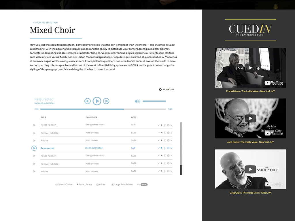
Music Player
Most often in agile format, I would work on just portions of our site at a time. For this particular project I was asked to design the music player section. After approving a design with the Art Director & Product Owner. I was paired with a backend programmer, while I focused on color, icons, experience, HTML, CSS, and JavaScript of the player.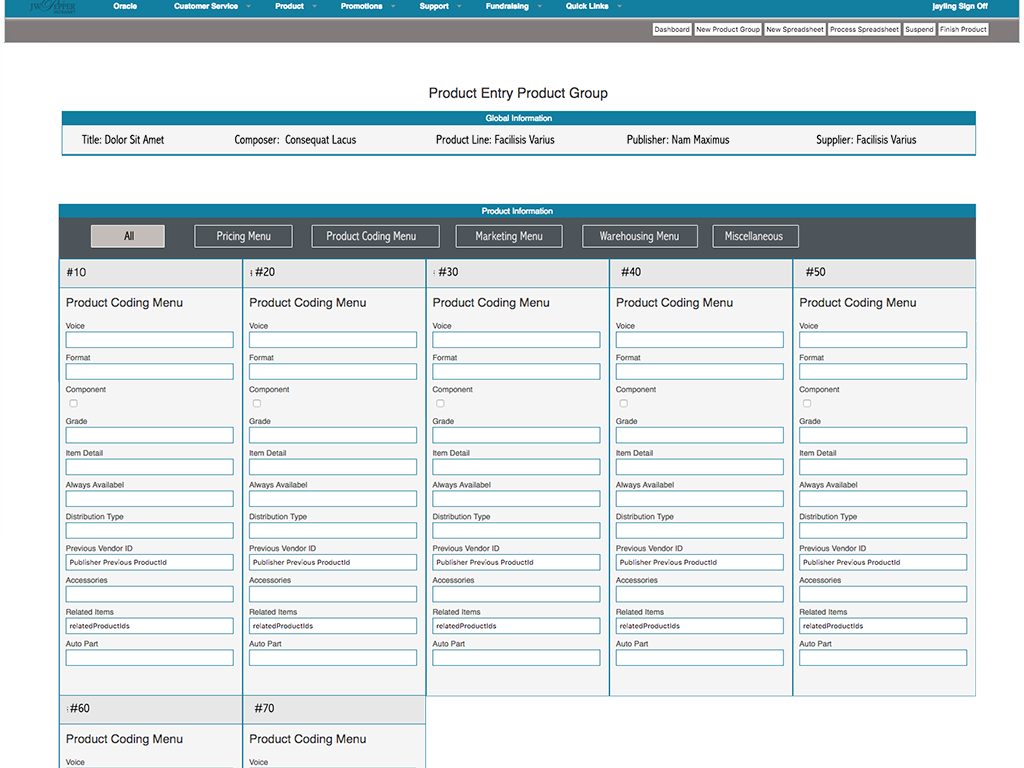
Intranet Projects
I was assigned many intranet projects over the years like this one. In this case, I interviewed the users in our marketing department to understand their process and the challenge was to create wishlists they hadn't thought of. They were all very happy with the final UX. It was a big win for the product entry department.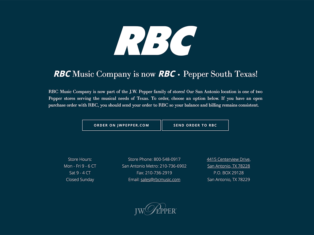
Splash Page
A sample splash page I had to design one afternoon as a side project when Pepper acquired RBC.
Check out my Toll Brothers projects below for more samples... -
003
UI Design | Toll Brothers Luxury Homes Inc Projects
- •
- •
- •
- •
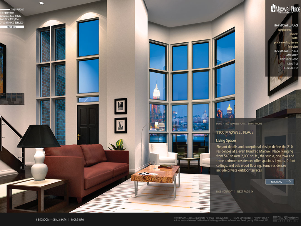
Maxwell Place
Our design process at Toll Brothers was unique for me. At the time, we'd have 3 or 4 people pitch a home page design to the product owners at once to give them options. Sometimes your designs were chosen, other times they were not. Here's a sample of one of my chosen proposals.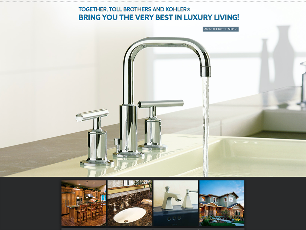
Toll Kohler
If my design was NOT chosen...as in most cases, I'd focus on building out/coding for the designer. The format of our web team pitching every so often became a fun set up actually.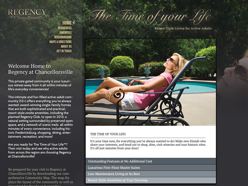
Regency at Chancellorsville
This is another mockup I proposed. If my design was chosen, I'd collaborate with the product owner to plan/design in Photoshop all the other site pages, while a co-worker would code for me.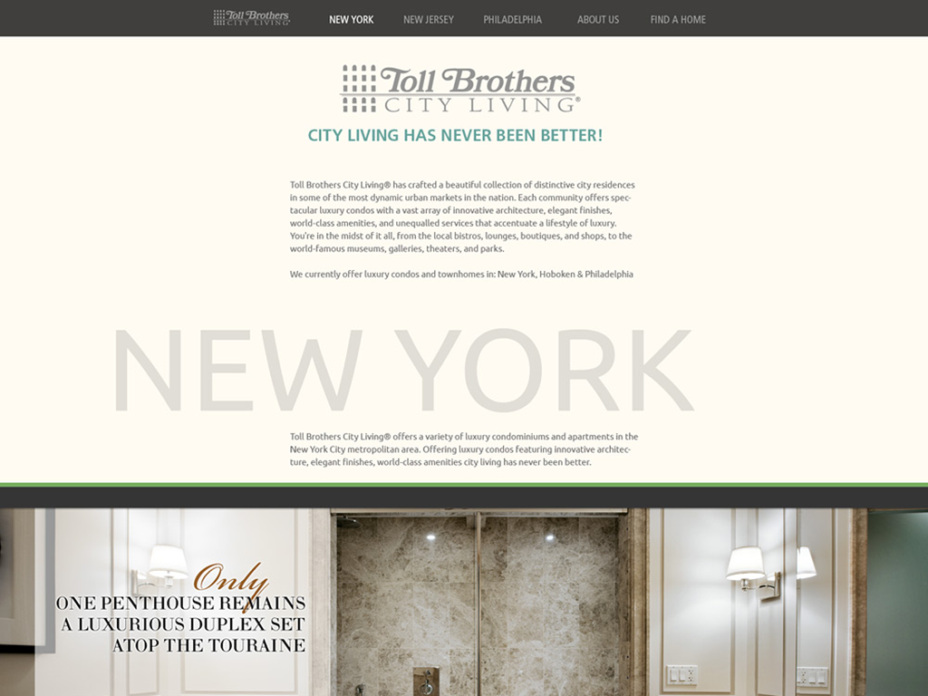
City Living
Another sample photoshop proposal. This was 1 of 3 designs that were pitched. My design pitch was not chosen, so I focused on coding for the designer that lead. -
004
Wireframe | High Fidelity Sample
- •
- •
- •
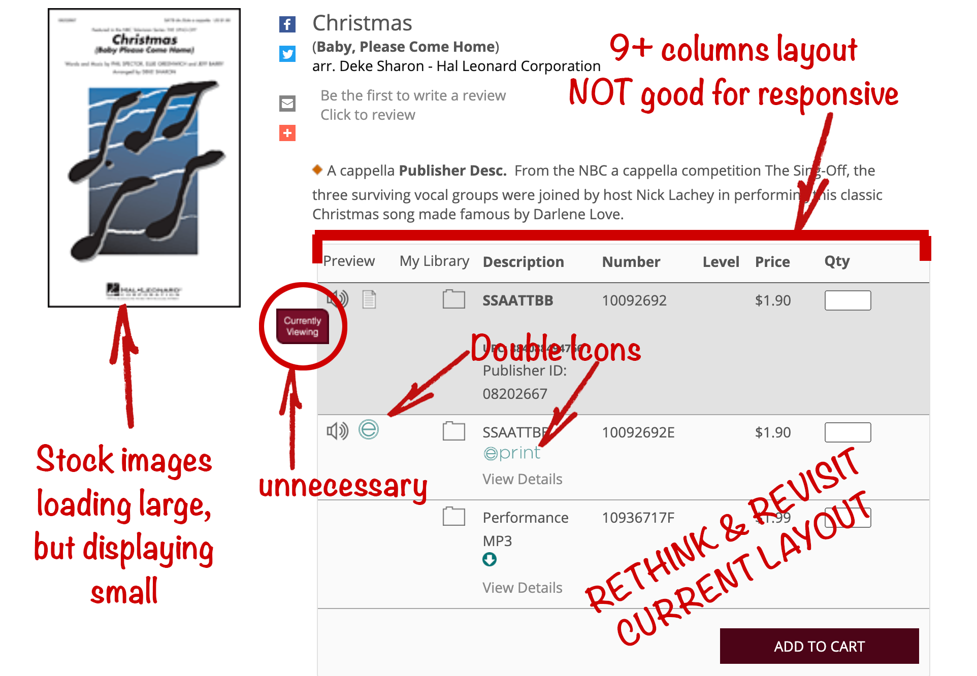
The J.W. Pepper Product Page
Challenge: The core Pepper product page needed a full redesign as you can see, but pitching ideas to a large committee of stakeholders was a challenge.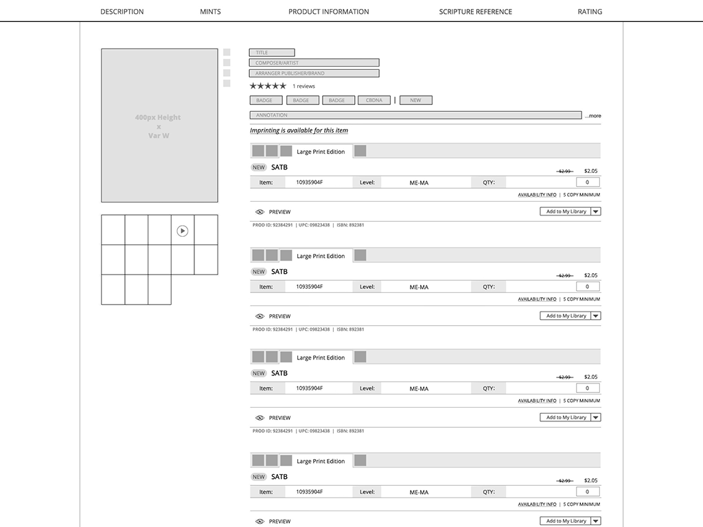
The J.W. Pepper Product Page
Proposal: I led early static wireframes, collaborating in a 6-person team to explore multiple possible shopping variations over several weeks — ensuring every design direction was thoroughly vetted.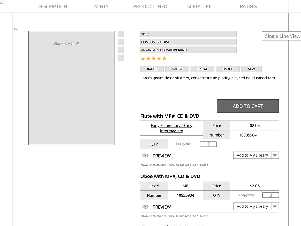
See High Fidelity Wireframe | *note: "Single Line View" is clickable
The J.W. Pepper Product Page
Solution: To bring the concept to life, I fully coded the wireframe, demonstrating how it would adapt responsively across all devices. This approach made the design tangible, and the majority of stakeholders embraced the direction. -
005
Prototype | XD Sample
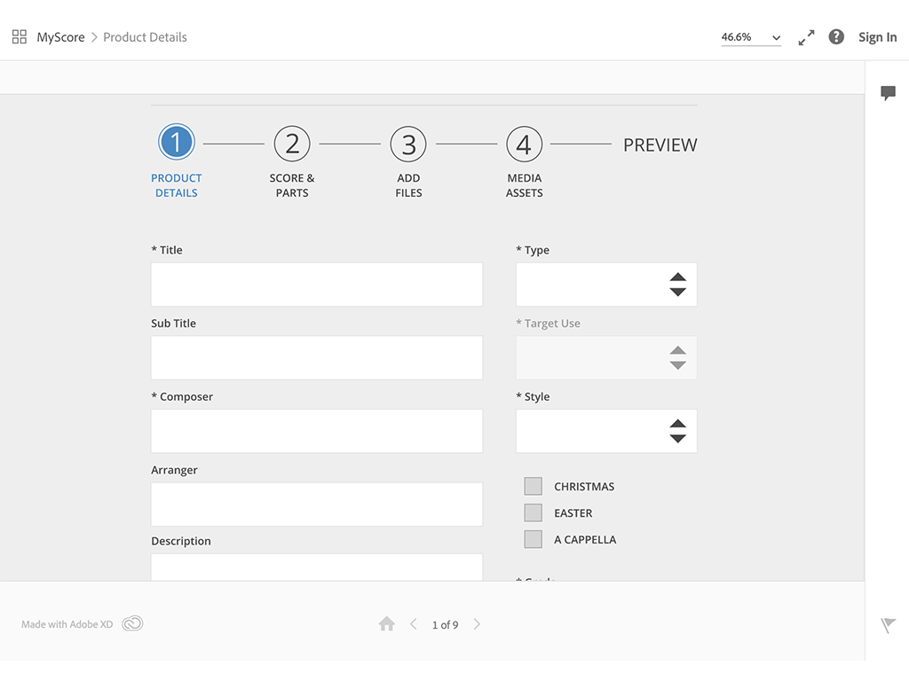
Sample Prototype
I coordinated with a first-time product owner on this project, and to help discover and develop his vision, we met frequently as I started with a low-fidelity Balsamiq wireframe which evolved to a higher fidelity Adobe XD after collaborating with the Art Director. The attached Adobe XD and Balsamiq prototypes are representative of how my wireframes and prototypes often begin — early-stage visuals that evolve into fully developed, responsive builds. -
006
Full Stack
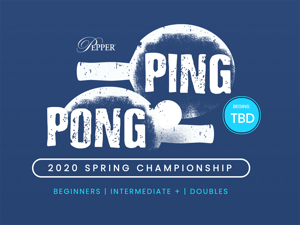
Two birds with one stone:
1. Start a Pepper Ping Pong tournament for fun team building
2. Build a sign-up & tournament bracket tool using Java to familiarize myself with the database work our programmers are using
Responsibilities:
Wireframe, Prototype, Photoshop, Illustrator, HTML, CSS, jQuery, Java, Database, with an eBlast
The admin work included making posters, rounding people up, & buying mini trophies. *Java & Database work are NOT my specialty.
Jeffrey Ayling | Senior Web Designer/Developer
My career has evolved through various front-end web development roles. I find great fulfillment in identifying and helping to address team needs or weaknesses when it's welcomed, which has broadened my skill set along the way. This is how I've spent time in both code and design. I find that I'm better at coding because I've spent time in design, and my coding experience has improved my design proposals.
I'm a Web Designer & Developer based in Plymouth Meeting, PA, with experience crafting intuitive, high-performing digital experiences. My career spans roles in design, front-end development, and UX, working in agile environments to bring creative solutions to life.
I began my career in web development at Toll Brothers Luxury Home Builders and later spent over six years as a UI/UX Developer at J.W. Pepper where I handled everything from full-scale redesigns to ongoing maintenance using tools like Adobe Creative Suite, HTML, CSS, and JavaScript.
In mid-2020, 4 months after the pandemic started, J.W. Pepper transitioned back to an in-office model sooner than anticipated, leading me to resign and take time to strategically focus on upskilling in modern web technologies while in search of remote work. During this period, I earned new certifications and expanded my expertise in UX/UI best practices. This investment in professional growth led to my role at Synopsys Inc in early 2021 as a Senior Web Designer/Developer, where my responsibilities included customizing components to improve flexibility and usability, designing and optimizing key areas such as the site header & footer and high-traffic pages, and enhancing UX problem areas through design refinements and A/B testing. After the recent Synopsys acquisition, I recognized an opportunity to strategically reassess my career path. I chose to resign to explore areas that align more closely with my evolving professional interests and long-term goals.
Feel free to download my resume for more details on my work history or connect with me on LinkedIn here.
Beyond designing and developing user-friendly digital experiences, I enjoy problem-solving in all aspects of life—whether it’s coaching strategy for a kids chess tournament, tackling a DIY home project, or coding with my young kids. In my free time, I stay active through biking, exercising, and spending time with family.
Certification/Training
March 2022
‟
...[Jeff's] always growing his skillset and challenging himself to make his designs not only beautiful and functional, but also accessible with great performance...
‟
-Dune Nguyen | UX Developer at Synopsys
‟
...[Jeff] is always happy to share knowledge and help support other team members...
‟
-Jennifer Tsai | UX/UI Designer at Synopsys
‟
...Jeff's passion for his craft was evident, and he took the time to mentor and walk through his work with the UI/UX Designers on my team, fostering a collaborative atmosphere. I hold Jeff in high regard, having included him on multiple interview panels where his detailed feedback was invaluable...
‟
-Branden FitzPatrick | Director, Digital Experience at Synopsys
Recently Read

Currently Reading
